available

YEAR
2026
ROLE
Design system — audit, architecture, docs
PLATFORM
Web, iOS
I owned the system layer: the audit, the token architecture, the component library, the file structure and the documentation. Another designer owned the product design. We worked in the same file.
The product was shipping. It had also scaled fast, and the designer who built it never had time to turn what he made into a system. That is a normal outcome under that kind of pressure, not a failure of craft. What it left behind was a file only its author could work in. Components had drifted into near-duplicates. The type set had grown past what anyone could hold in their head. Screens were named for whoever drew them.
My job was the system layer, not the product design. So the measure was never how it looked afterwards. It was whether a second person could open the file and tell what was correct.
Four steps, in the order the work happened: read the file, fix the variables underneath it, rebuild the components on top, then bring the screens into line.
1
WHY
The file was shipping and I had not built any of it. Before touching a component I needed to know what the product did, which screens existed, and which of them were still true. That work produces nothing to look at, which is why it usually gets skipped.
STRUCTURE
I went screen by screen to understand the product’s logic, then did the same with the text styles: an audit of what was actually in use. Styles that no screen referenced were struck through and removed.
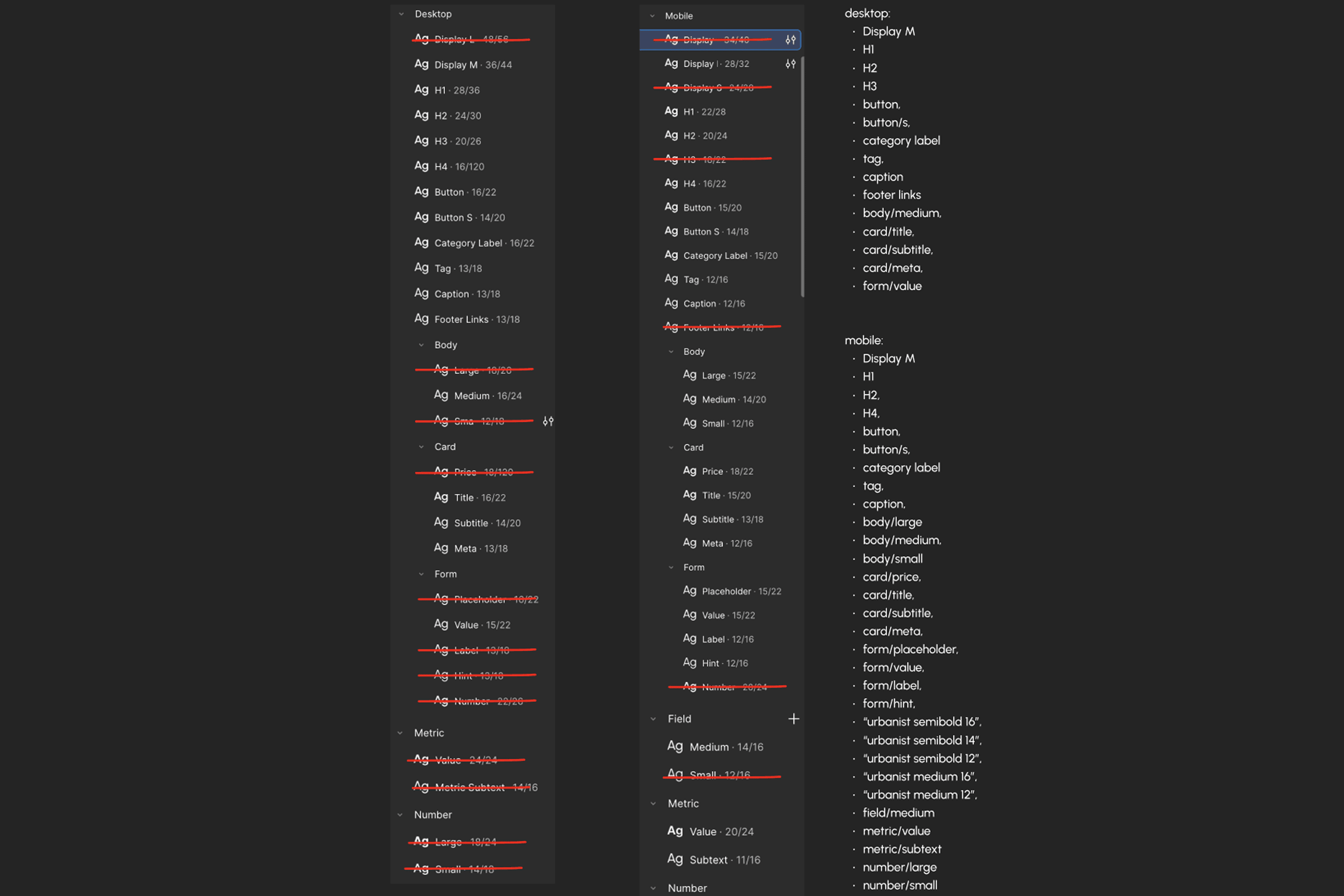
An audit of what was actually in use. Styles that no screen referenced were struck through and removed. The column on the right is what survived.
2
WHY
Colour was applied literally. A token named after what it looks like has to be renamed the moment the brand shifts, and every reference breaks with it.


The variables themselves: 36 semantics pointing at 24 primitives, plus 11 number tokens for spacing and corner radius.
3
WHY
The same object had been drawn several times — a property card on the listings feed, another on the detail page, another in My Listings. Near-identical, separately maintained, and quietly diverging.
STRUCTURE
One card component now covers every case through properties: listing, investor request, agent post, compact row. What matters is not how many components are left. It is that designers and developers work from the same documented file and neither has to ask the other what is correct.
Role
Reusable object container.
Behaviour
Adapts to content length · supports conditional content visibility · maintains consistent hierarchy across variants.
Three lines — enough for a developer to know what the component does with content it has not seen yet.

Listing, investor request, agent post and compact row are the same component under different properties.


The same component in use.
WHY
Documentation that describes a component tells you what it is. Rules that say what it must not do are the ones that hold, because they answer the question a designer has when the component almost fits.

The Button page. Four roles, every state, plus link and icon variants, with the rules that decide which one a designer may reach for.
4
WHY
Naming came last for a reason. You cannot label a screen by its state until the system defines what the states are.
STRUCTURE
Every screen renamed to Section / State, sorted into 35 sections that follow the product’s own flows.
New screens are assembled from documented components instead of drawn from scratch. Drawing was never where the time went. It went into deciding which of several near-identical components was correct, and whether a text style could be trusted without overriding it.