available


YEAR
2025
ROLE
Product & web design
SCOPE
App, landing page
I designed the app and the landing page that sells it. Both themes, every state, from onboarding through to settings.
Personal finance apps are built on manual tracking. Log every coffee, categorise every transaction, and eventually the picture becomes clear. Flowly starts from the assumption that most people stop long before that. By then the app has become a record of not keeping up.
So the product takes the opposite position: you should not need complete data to make a confident decision about money. Two places had to carry that. The setup, where most finance apps lose people first. And the daily act of adding an expense, where they lose the rest.
Each one removes something the user would otherwise have to supply, decide or maintain.
1
WHY
Budget setup is normally a wall of empty fields presented to someone who does not yet know what the app will do with them. It is the highest-drop-off screen in the category, and it asks for precision before it has earned any trust.
STRUCTURE
Onboarding runs as a chat with the assistant instead of a setup form. It asks eight questions, one at a time, and most are answered with a tap.
THE QUESTION THAT IS NOT ABOUT MONEY
Step four asks what brought you here today. It has no effect on the arithmetic. It exists because a budget someone set for a reason they can name is a budget they are more likely to keep.


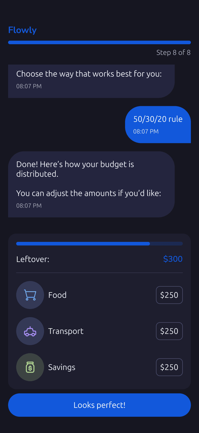
Steps 4, 6, 7 and 8. The progress bar is the only conventional form element left on the screen.
2
WHY
Most budgeting apps ship one methodology and treat disagreement as user error. But 50/30/20 fits a salaried renter and fails a freelancer with variable income, and neither of them is wrong.
RESULT
The final setup step offers three ways to split the same budget: the 50/30/20 rule, an even split, or distribution by how important each category is to you. Each is one line of plain language, no jargon, no default pre-selected.

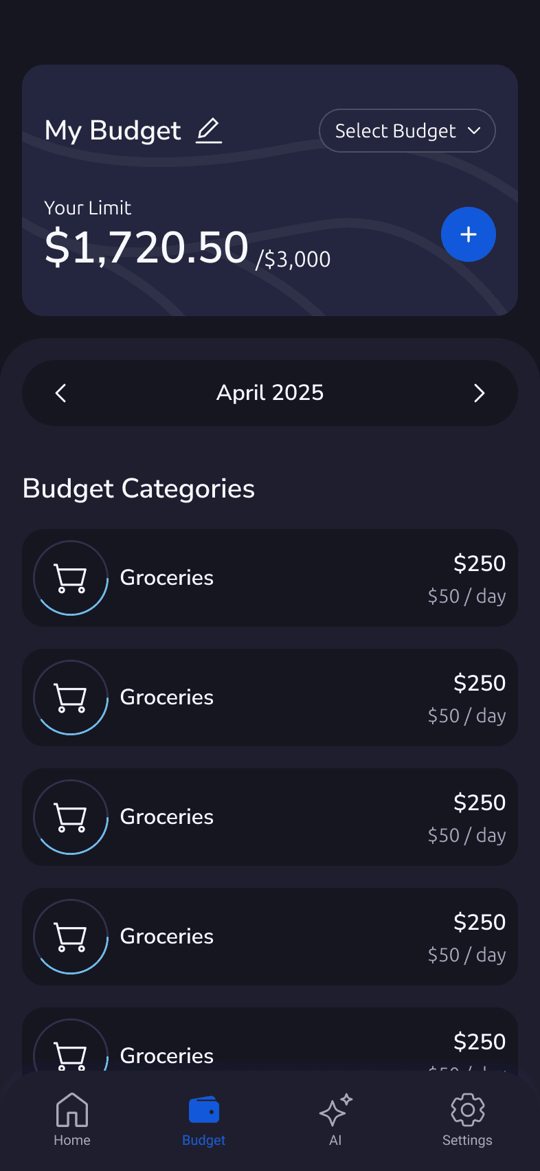
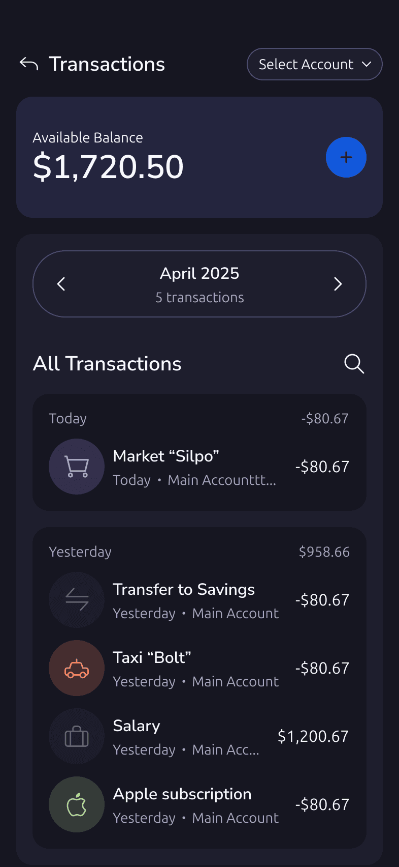
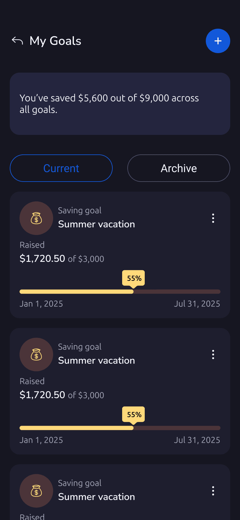
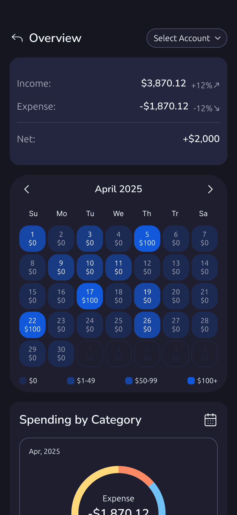
The four surfaces the budget lands in once setup is done: home page, budget, transactions, goals.
3
WHY
Manual entry is where this category loses people. If the premise is that you should not have to track everything, the cost of adding one expense has to fall below the point where skipping it feels easier.
RESULT
Expenses are added by voice or by scanning a receipt. The typed form still exists. It is simply no longer the default.