available
A matching platform that pairs women with mental-health specialists through a short quiz. Two account types, desktop and mobile, mine from first screen to last.

YEAR
2026
ROLE
Sole designer
SCOPE
Desktop, mobile
Sole designer. The matching quiz, both account types, booking, profiles and settings, on desktop and mobile — 134 screens.
Directories solve the supply problem and leave the hard part to the user: a wall of profiles, filtered by city and price, evaluated by someone who is already depleted. The comparison is exhausting at exactly the moment comparison is hardest.
SheSpace inverts it. A five-step quiz asks what the person is dealing with, then the platform does the shortlisting and returns one recommendation with alternatives behind it.
The first two reduce what the person has to decide. The third keeps the two sides of the marketplace from contaminating each other.
1
WHY
A grid of equally weighted results hands the comparison back to the user. If the quiz exists to do the shortlisting, the result screen has to commit to an answer or the quiz was decorative.
STRUCTURE
A single primary match, full width, carrying a visible match score and the specifics that justify it: experience, location, languages, specialisations. Alternatives sit below in smaller cards. Browse All Specialists stays available for anyone who wants the directory anyway.


2
WHY
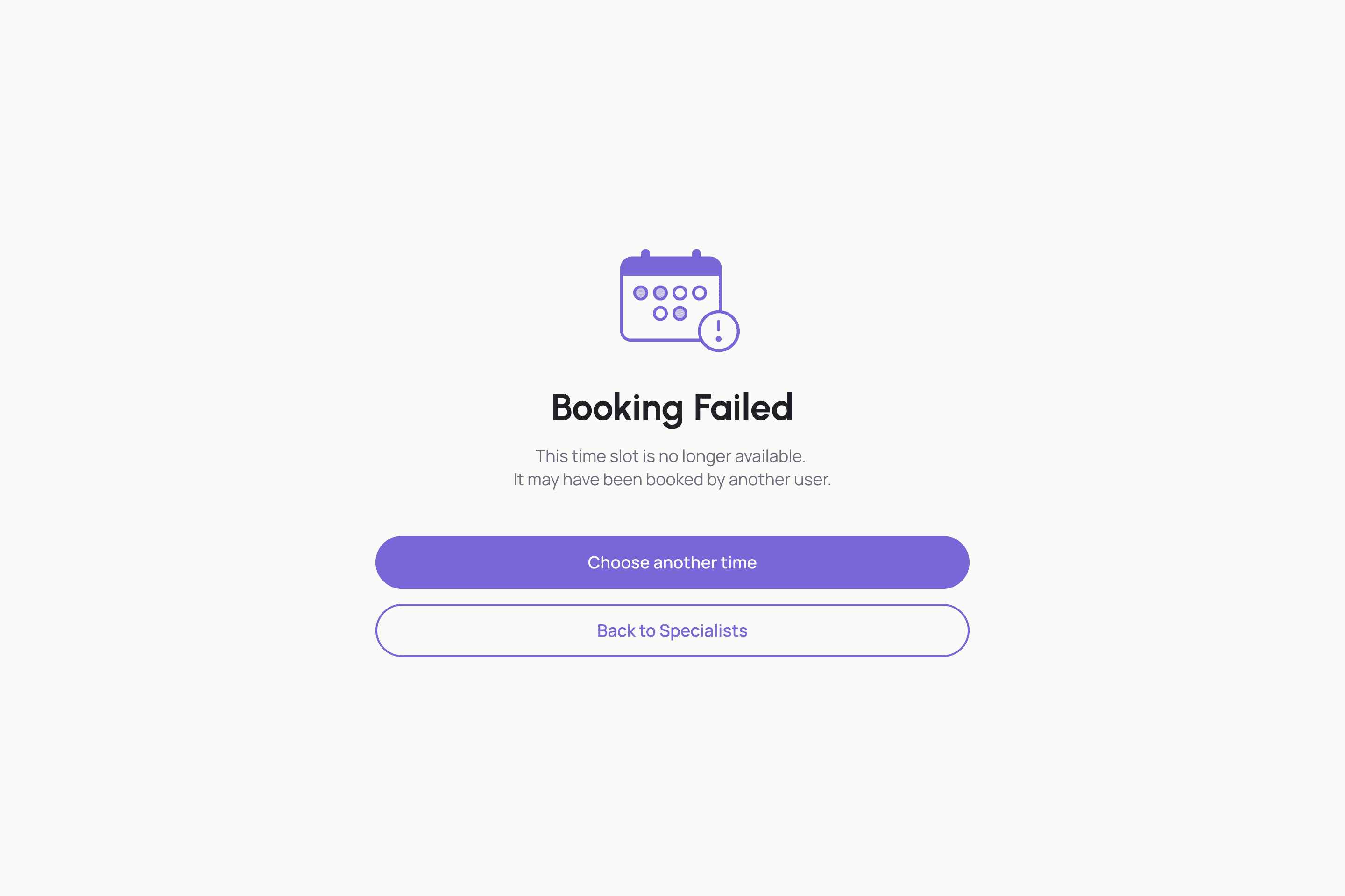
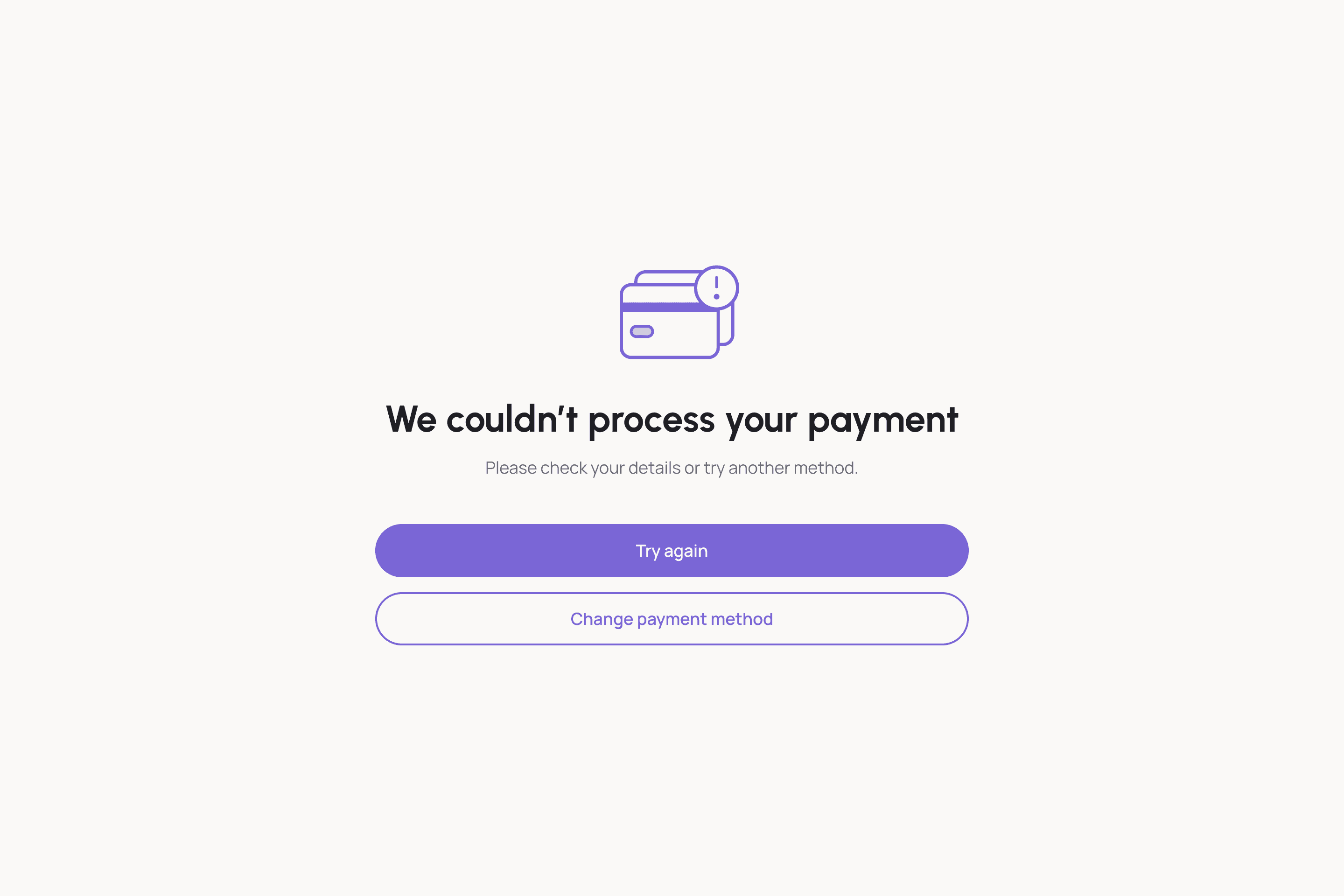
Here a booking failure is not an inconvenience. Someone has decided to ask for help, answered the quiz, chosen a person and reached for their card. A generic error at that point costs more than a session.
RESULT
Booking has its own failure design: the slot being taken and the payment failing are separate screens with separate recovery paths, because the two need different next steps. Twelve empty and error states across the product, each in both platforms, and none of them left for the build.
3
WHY
Clients and specialists want opposite things from the same product. A specialist needs licences, availability and a public profile; a client needs privacy, matching and booking. Merging them into one account type pushes that complexity into settings, where nobody finds it.
RESULT
Separate signup and verification paths, separate profiles, separate settings. That comes to 28 specialist profile screens against 22 for clients, because the specialist side carries licences and credentials, each with its own empty state.


The platform shipped. Someone arriving unsure can answer five steps and leave with one name, a reason it was chosen, and a booked session. No profile comparison required.